
Digital Projects
This is a gallery of all the digital projects I have worked on, including work on Figma, Canva, Procreate, and Adobe Illustrator

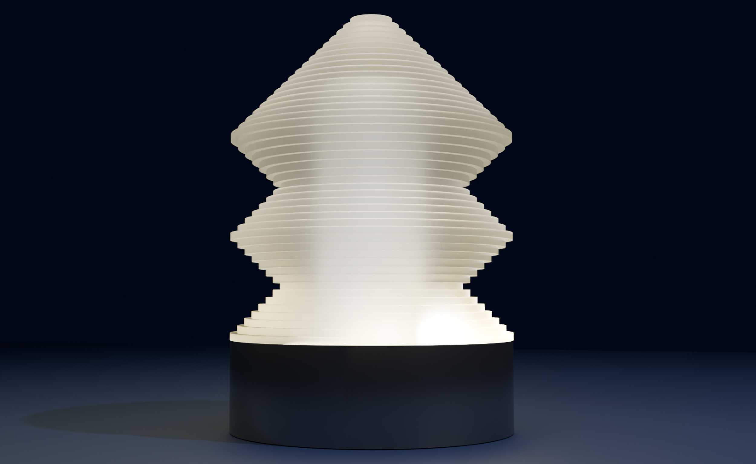
Layered Acrylic Lamp
This project explores form, light diffusion, and fabrication logic through a layered acrylic lamp concept. The geometry was modeled in Fusion 360, then rendered in Blender to test material behavior and lighting conditions. The design is intended for physical realization using laser-cut acrylic rings stacked over a CNC-machined metal base, emphasizing the connection between digital modeling and fabrication.
Bevel Gears with Concealed Pulley
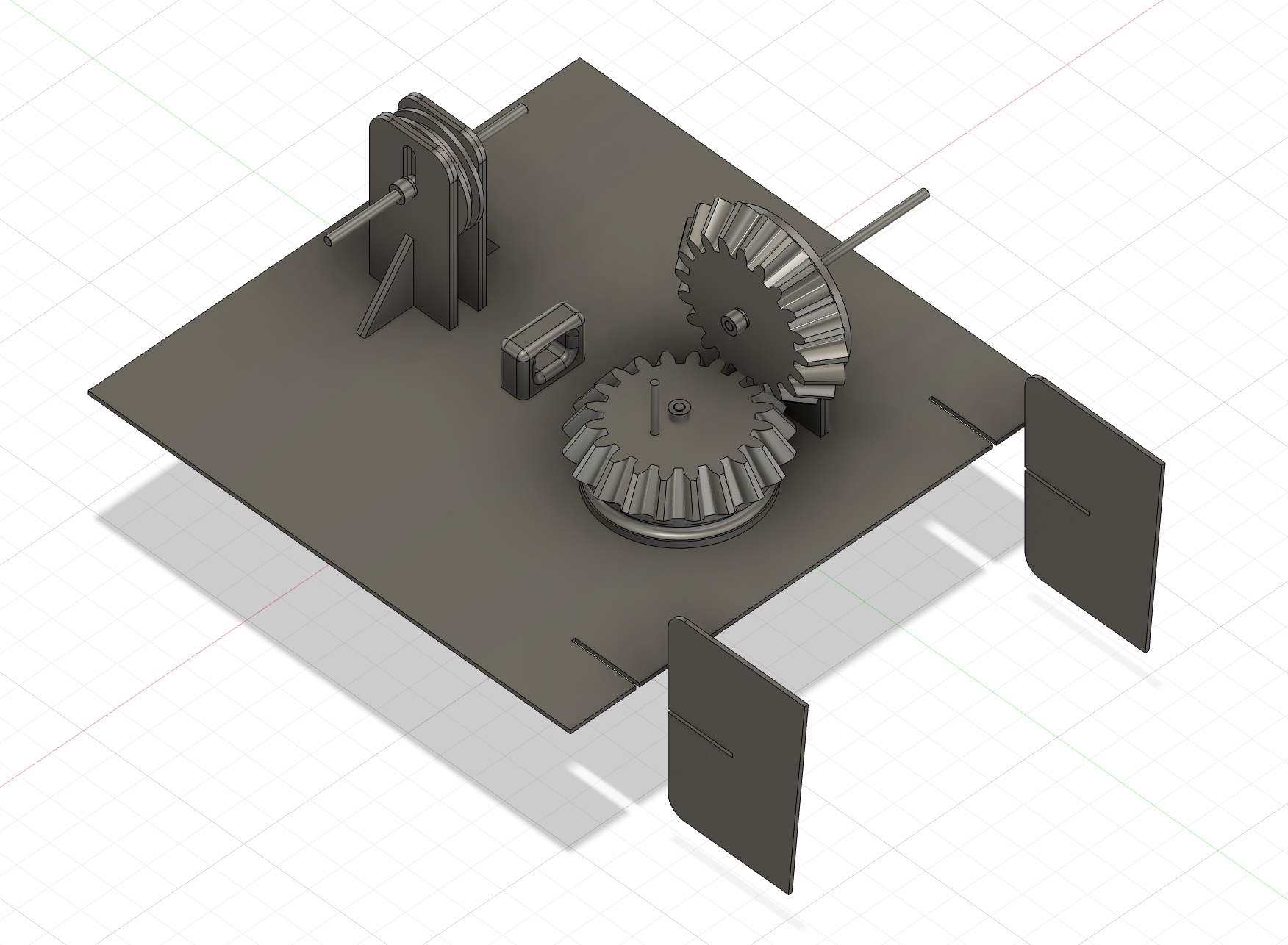
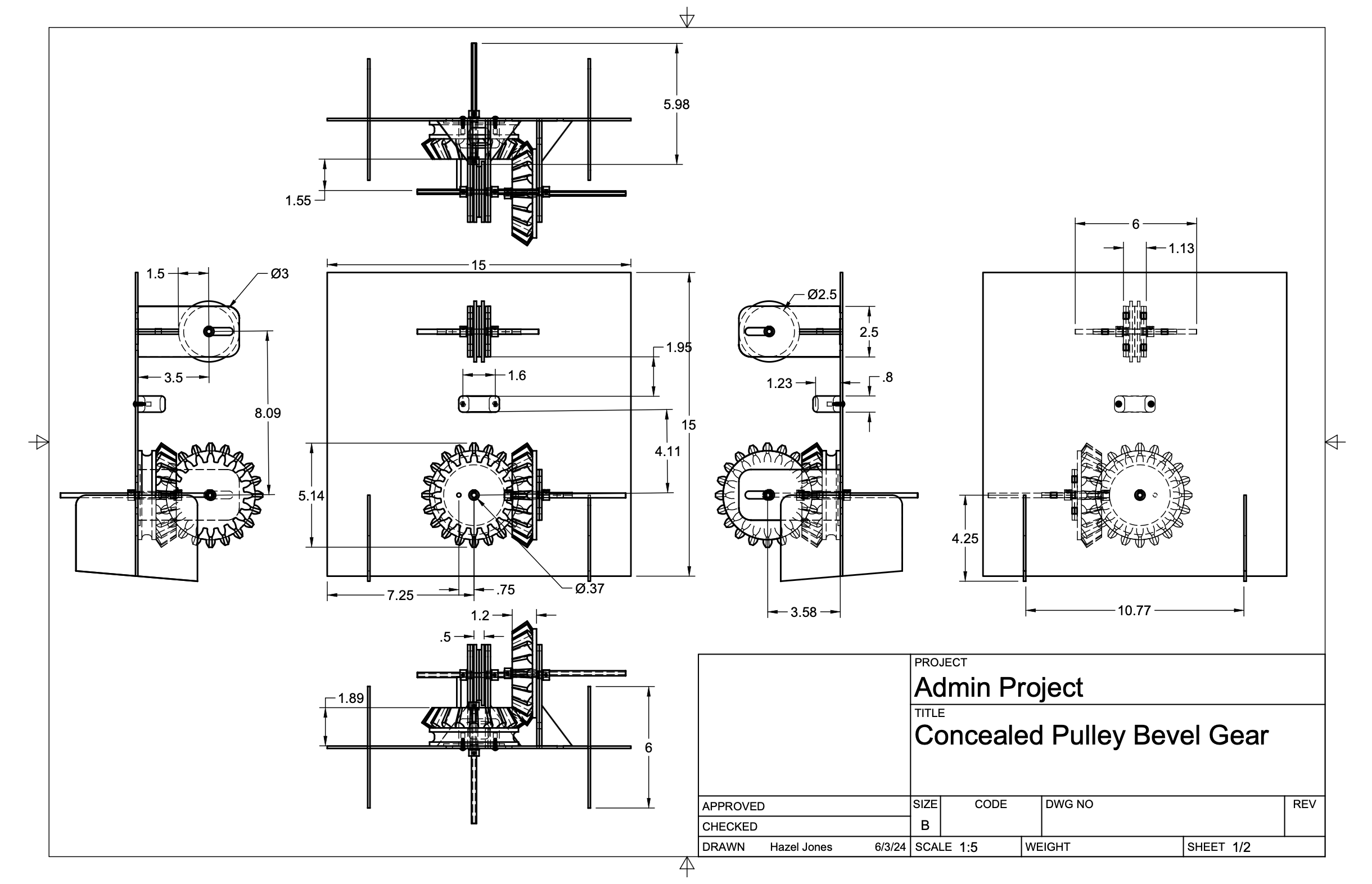
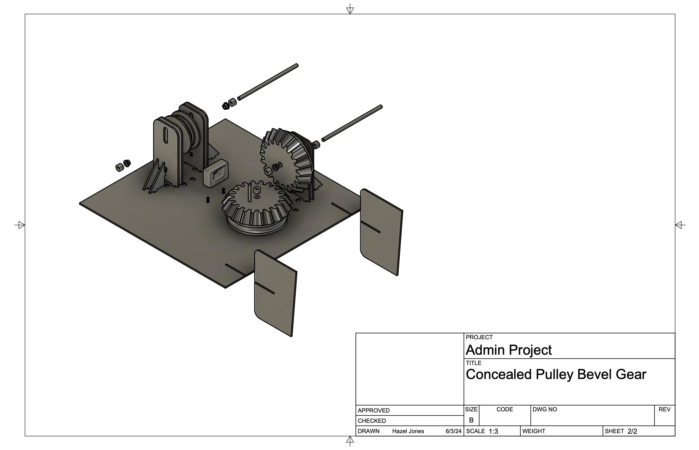
This assembly was modeled in Fusion 360 with close attention to real-world constraints, including shaft alignment, fastener selection, tolerances, and part clearances. The piece also had to be fabricated without adhesives, meaning that every component was either press-fit into the backboard or joined with hardware. The bevel gears and concealed pulley were designed as an integrated mechanism, which took careful alignment to ensure proper fit and, eventually, assembly. Every fastener, shaft, and piece of hardware was modeled to validate scale and assembly order prior to fabrication. The design was ultimately realized as a physical prototype using laser-cut wood for the pulley components, 3D-printed gears and a loop for the pulley to pass through, and a laser-cut Duron backboard, translating the digital assembly into a buildable system.
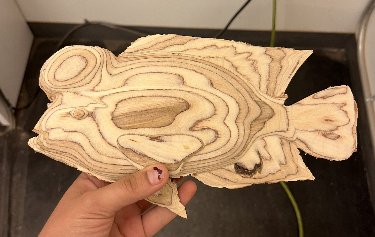
Midas Cichlid
This piece was part of an ongoing exploration centered around finding species that exhibited queer behaviors and realizing their forms through CNC milling.
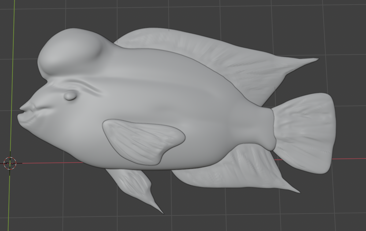
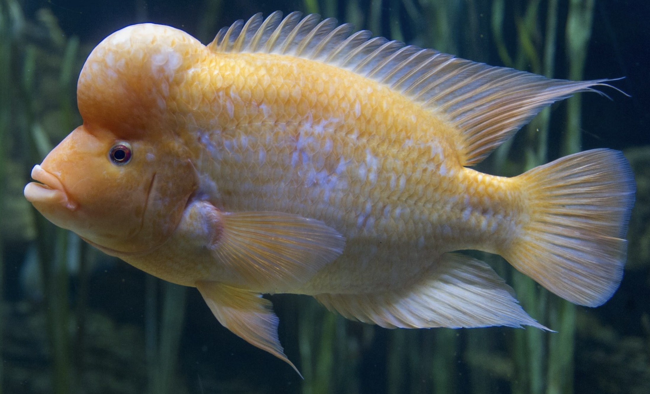
I began with close study of photographs of the Midas cichlid, then focused on capturing the fish’s distinctive body shape before refining the fins and surface details. The modeling process moved back and forth between adjusting proportions and simplifying forms to ease workload on the CNC, and the whole exercise was strong practice in balancing anatomy with a model that could easily be milled out of wood
Initial Sketches
The president of Off The Grid, a girls and nonbinary-oriented outdoor club at UC Santa Barbara, reached out to me for help with logo design. In fact, the name Off the Grid (or OTG) was relatively new — the club had recently split from the Backcountry Squatters, a nationwide organization that had been failing to offer aid with funding or organization. Along with this newfound freedom, the club needed to rebrand, creating a new social media presence to connect with current and future members that was completely separate from the Squatters.
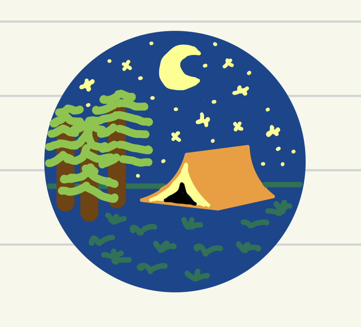
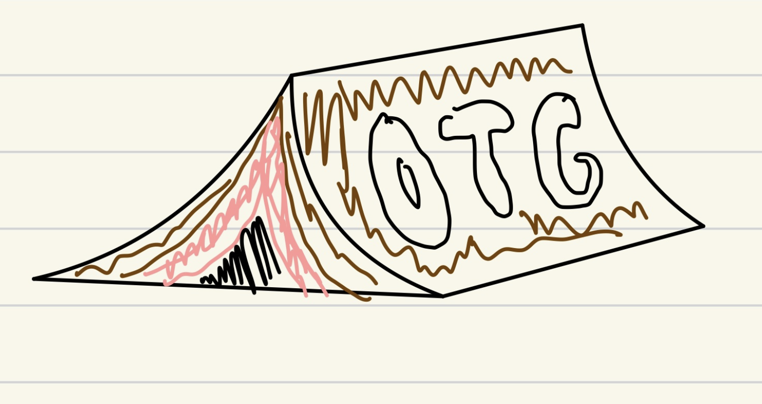
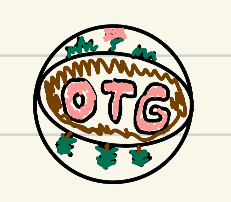
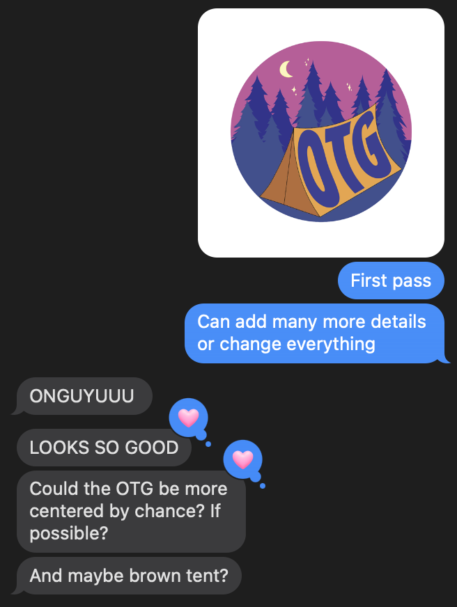
The club’s president provided some sketches roughly outlining directions a new logo might take. I pulled out some motifs from her renditions, focusing on the tent and the open-air feel which aligned with the club mission. Taking these all into account, I used Adobe Illustrator to produce a mock-up of a logo, which I sent for her review.
After seeing the first pass, she also requested several alternate colorways, as well as a non-circular version of the logo (which she requested include hiking boots) for use on club stationary and posts. I recentered the tent, duplicated the logo, and recolored it in a variety of ways to produce ample options for review.
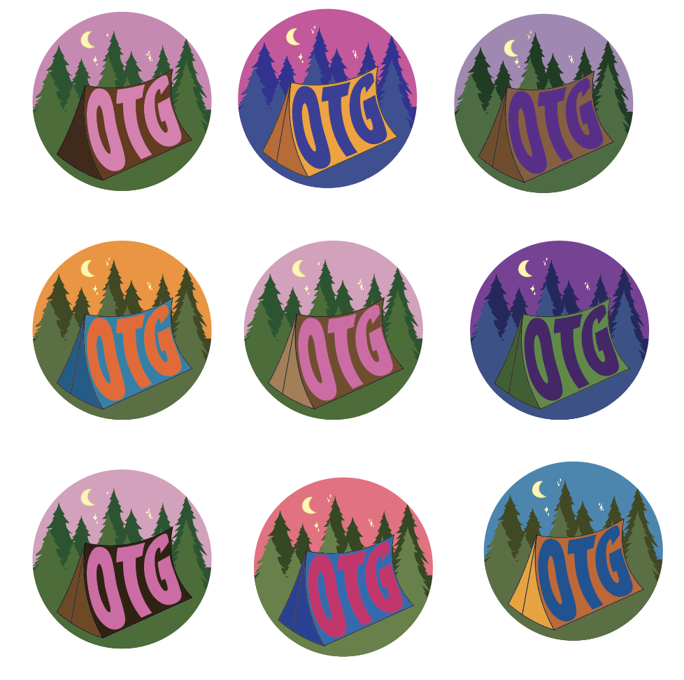
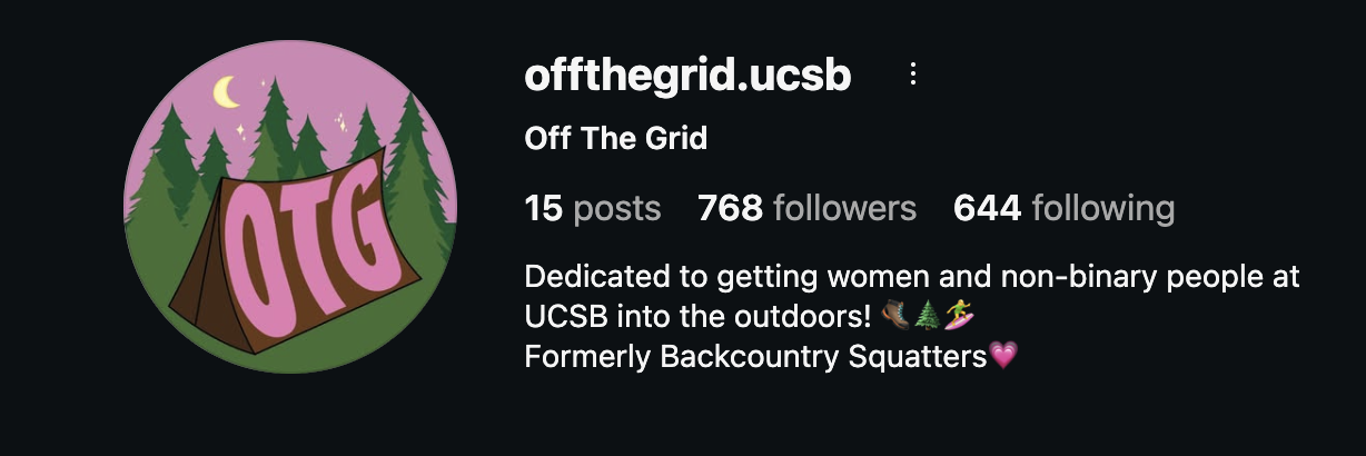
After carefully reviewing the options, she felt that the top left logo, which revolved around dark brown, dusty pink, and vibrant green, best captured the outdoorsy, open air feel of the club and subtly communicated its goal to provide a safe space for women and nonbinary members to explore the natural world.
Having reached an approved design for the circular logo, I moved on to workshopping the more freeform club marking. I wanted the curving throughline to echo the idea of a hiking trail or treasure map, while simultaneously pulling together the three components of the full logo.
I had also hoped to preserve the tent motif, but after discussing aesthetics with the club’s president and pondering them on my own, I decided its simplistic form was too contrasted with the more detailed hiking boots, and was distracting from the intent.
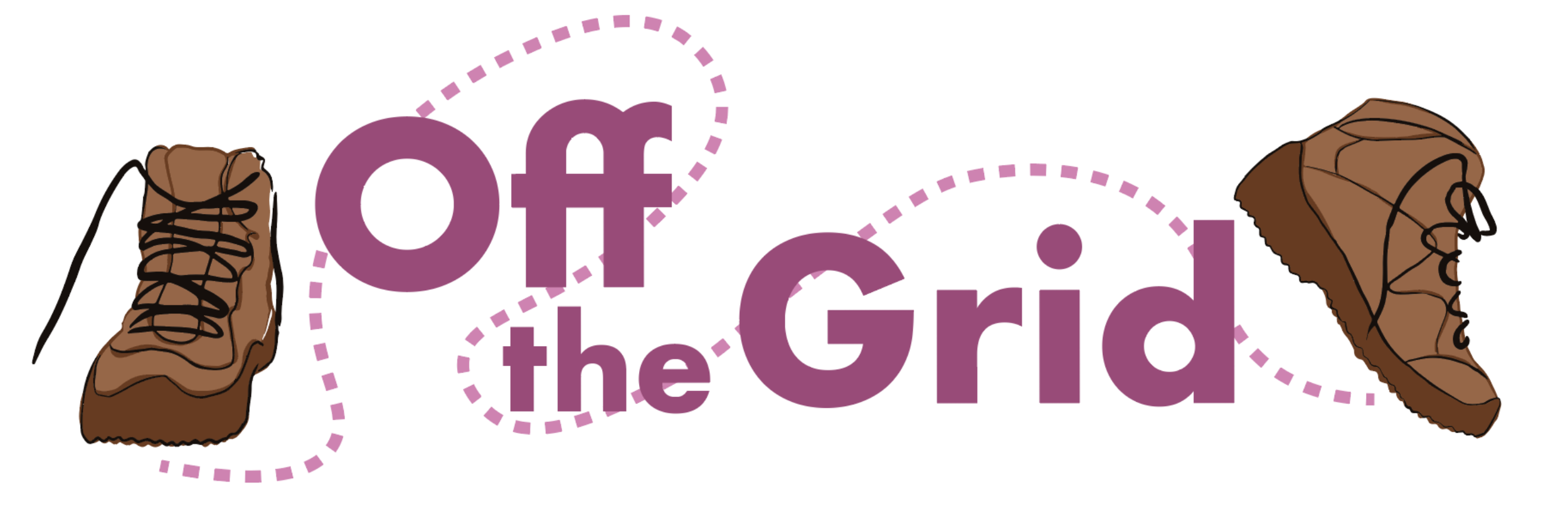
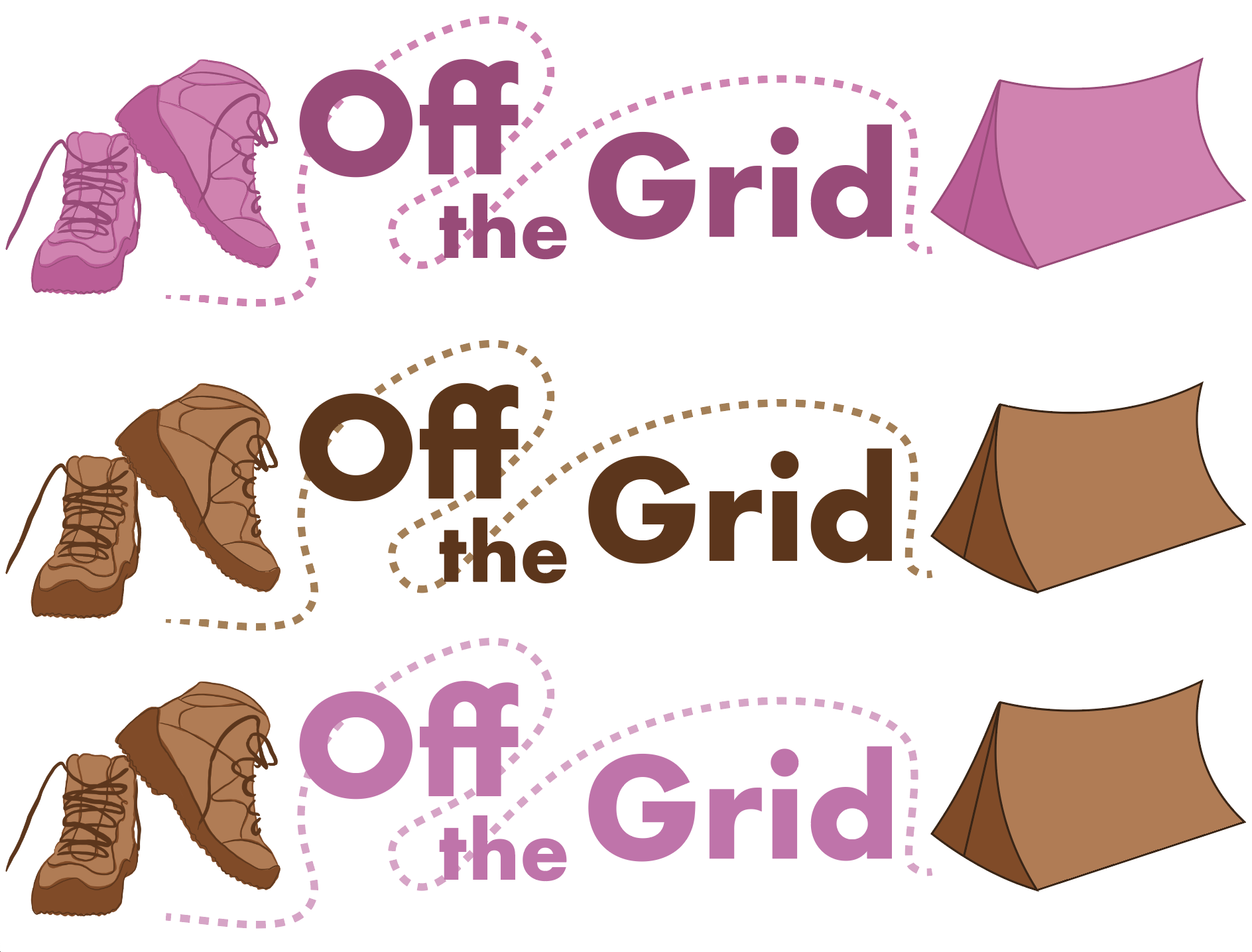
This tension between the boots and the tent is what led me to realize that each boot could act as a bookend for the text, creating a more cohesive sandwich that recalled the colors of the circular logo while improving the dynamics of prior iterations. I also darkened the brown of the boots to increase contrast and create more visual interest. This was ultimately the design that most resonated with the club’s board, and has since been implemented on their socials.
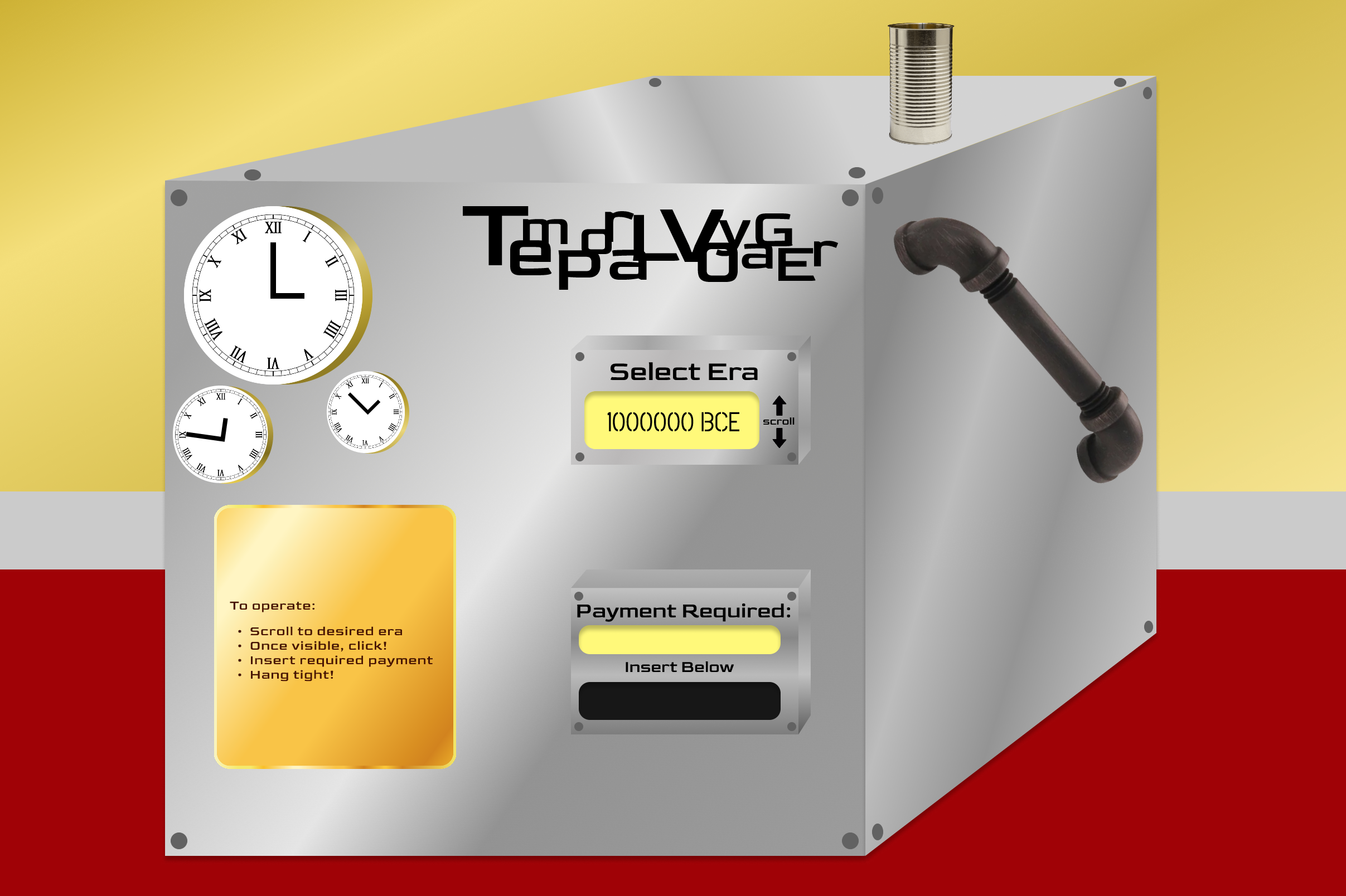
The Temporal Voyager
An exploration of animating and wiring interactive designs in Figma. In this group project, I was responsible for the pathways unfolded by selecting “1000000 BCE” and “4000 CE”, as well as the introductory animation, the design and functionality of the main interface, the wiring of the bag interior, and the wiring of the buttons throughout the experience. The ultimate goal was to put together a UI that felt fun and adventurous, and took the user through a series of adventures.

A run-through of one of the pathways in the simulation.
Graphic Design — Design 60
Prompt: “Design a poster based upon a subject about which you have strong feelings. Communicate these feelings as much through form as by descriptive or symbolic means. Your poster should evoke a direct emotional response even before it is read.”
As a longtime Brooklyn Nets fan, I chose to make a poster advertising their upcoming game, with the intent of generating a sense of action and excitement.
